

I've been designing new book covers
and finding free sci-fi comedy books to share with you

I’m working on a cover design for my new book, which I’m announcing right now, called SEVEN STORIES ABOUT TIME TRAVEL. If anyone remembers my almost-funded Kickstarter project, EARTHLOOP, this book has an odd relationship to that trilogy. Both are about time travel. SSATT is a standalone collection, and should hopefully get people to start seeing me as “That guy who writes time travel stories” so when Earthloop comes out, there’s some recognition there and a bit more of an audience! SSATT is already 90% written, so it’s coming out first.
SEVEN STORIES ABOUT TIME TRAVEL has a very obvious title because the philosophy behind it is much simpler than the one for Who Built The Humans?.
Mainly, “Publish a short story collection about time travel”.
These are all new stories. I had a folder of time travel stories and picked my favourite seven to develop for this book.
So. Cover design.
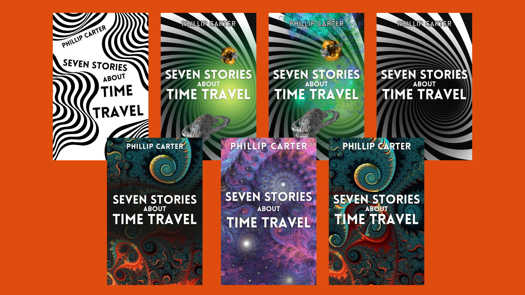
Going left to right, top row to bottom row, we have designs 1 through 7. This order is important because I’m going to ask you all to vote for your favourite at the end of this newsletter.
I like these covers. My favourite ones are 1, 5, and 7, though 4 is also quite cool. I am tempted to reserve the monochrome ones for future hardback releases, like I’m doing with WBTH (not reached enough sales to warrant a hardback for that yet, as I want Halfplanet Press to use Hardbacks as luxury collector’s items, as vinyl is to cds).
A lot of thought has gone into these covers. If you look at Amazon’s bookshelves for ‘time travel books’ you get a lot of covers that share a design philosophy and that, admittedly, I do not find very interesting. I’m weird, so I pick up the covers that the majority of people don’t pick up. I’ve got a thing about bold, minimalist covers right now, provided they are done right and don’t look ‘corporate’.
I want SEVEN STORIES ABOUT TIME TRAVEL to stand out.
Thinking of cover design. I’m in a free eBook swap with Kerrie A Noor at the moment, with her book Rebel Without A Clue. Here’s the cover.

I’m a big fan of this cover. I’d pick it up right away. You know it’s sci-fi comedy from the art alone, but then the box specifying it’s ‘A sci-fi comedy for women’ brings that fact to the forefront of your mind and elaborates upon it. There’s brilliant contrast too. All this makes it very easy for the right reader to pick up, which is sort of my point. I want the right people to find SSATT and pick it up. Not everyone, perhaps not a big crowd at all, but the right people. The people who will message me about it months later, as people have with WBTH.
Kerrie is definitely reaching the right audience with this cover. And the synopsis isn’t bad either.
“Planet Hy Man’s energy is running on empty and earth is their only hope. The only problem is, no one wants to go there."
Mex is ready to hang up her catsuit and watch the galaxy pass by. But when she is ordered to save Planet Hy Man or kiss her pension goodbye, she has no choice but to don her leathers and head to Scotland.”
You can grab the book FREE this week by clicking here, or you can copy the link for future reference. So this week’s free story is by Kerrie, not me!
https://dl.bookfunnel.com/2cqgodvy2s?tid=f7a9gaxl42
Disclaimer: I don’t get paid to mention fellow authors in my newsletter. I do it to help other authors find new readers, and only if their books are relevant to what I’m writing about, usually Science Fiction or Comedy. At some point, when I have 10,000 readers or more, I imagine a big brand like Pepsi might purchase my soul and make me advertise some faceless product, but right now my soul belongs to silly stories about space written by cool people I discover on the internet. And also the leading fried chicken fast food chain. It’s crunchalicious! BUY THE CHICKEN!!!
Did I just invent the word crunchalicious for a footnote joke? Yes.
So. Cover design. Last week I posted a talk show episode with author and cover designer Sandy Butchers, and this week I have bothered her with a long list of ideas for my book cover design for SEVEN STORIES ABOUT TIME TRAVEL. We had a brief conversation about design philosophy, and she picked her favourites from the selection. I won’t tell you what they are though. That spoils the fun.
So, here’s my goal for the cover.
Stand out to the right people
Make it obvious the book is about time travel
If possible, avoid time travel cover tropes (no pocket watches)
Look good on a shelf and on a small thumbnail image online
With that in mind, which cover do you prefer?

Left to right top row is 1,2,3,4. Left to right bottom row is 5,6,7.
This poll will only last 6 days, so vote now! You might just shape the cover of this next book.
My plans from here are to consider where to launch beta reading, pre-orders, among other things. I could Kickstarter this one too, and set the money goal quite low to make my life easier. That would be good, and like I said earlier, would get my name out there as ‘the time travel writer’ so people trust me with an entire time travel trilogy, whenever that comes out. But for something this simple, pre-orders through Etsy could work (that’s how I funded WBTH).
Oh, and there will be a subtle link to Earthloop. Maybe Lax Morales shows up.
Thanks for voting and commenting!
My next post will be a complete short story from me. So if you’re not already subscribed, it would be very nice if you did.
So in the middle of writing this newsletter I was invited out to watch MOONAGE DAYDREAM and it was great. Perhaps I’ll talk about it in an upcoming post.
I have this constant urge to try new things, which this year, included roller skating and writing wedding poetry. Bowie has again inspired me to try even more new things, and to travel. I may vanish to America soon.
Number six is best. The ones you like, five and seven, are way too dark. The monochrome I’ve seen done before, but if you want monochrome then one is more unusual than the alternative.
Covers two through four strike me as a bit cliched: they remind me of movies and TV series showing such a spiral to indicate time passing (with or without a ‘travel’ element). Didn't the outer limits use a swirling spiral as part of their intros? (or am I just showing my age?) Although #4 might well work for a hardcover book
Covers 5 through 7 hint at that spiral image but with a strong suggestion of fractals which appeals to me. #5 is very dark and very busy overall, and I wonder how much detail would be lost in a thumbnail. (and would that be critical?) #7 although lighter than #5, has the same problems.
My vote falls on #6: it is much lighter and less crowded with detail, and the sprinkling of stars (or are they galaxies?) suggest a timelessness, or perhaps an Infinity of time.
I hope this helps.