Sorry about that, seems to only work for subscribers which feels unfair. Glad you commented. Your point about the monochrome one is particularly insightful. It has the same effect on me, but I have synaesthesia and like the sounds and colours it makes at the back of my head. Sometimes I forget not everyone has the same reaction to weird patterns!
A lot of people are leaning toward 7. If I can make the title easier to read I'll go for that one most likely, but 5 exists as a decent alternative. That said, these were all crafted over one feverish evening so there's still some refining to do. I quite like 6 but am not 100% sure how it would look on a bookshelf compared to the others. 7 is more striking!
Covers two through four strike me as a bit cliched: they remind me of movies and TV series showing such a spiral to indicate time passing (with or without a ‘travel’ element). Didn't the outer limits use a swirling spiral as part of their intros? (or am I just showing my age?) Although #4 might well work for a hardcover book
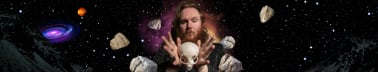
Covers 5 through 7 hint at that spiral image but with a strong suggestion of fractals which appeals to me. #5 is very dark and very busy overall, and I wonder how much detail would be lost in a thumbnail. (and would that be critical?) #7 although lighter than #5, has the same problems.
My vote falls on #6: it is much lighter and less crowded with detail, and the sprinkling of stars (or are they galaxies?) suggest a timelessness, or perhaps an Infinity of time.
I agree with you 100% about 2,3,4, including the hardcover comment. I am thinking saving the black and white covers of all my science fiction for hardbacks, released when the demand is there.
I could add stars to 5 or 7. I'm glad you've spotted some symbolism in the design choices for 6. It seems to be the most popular one at the moment, aside from 1.
Number six is best. The ones you like, five and seven, are way too dark. The monochrome I’ve seen done before, but if you want monochrome then one is more unusual than the alternative.
All good points. I've been playing around with making five a bit brighter and adding contrast.
Seems most people are settling on 6! So I'll be drafting up some refinements to that one in the next few days. Currently playing with mirroring the image.
Monochrome is probably going to be reserved for the eventual hardback. Interestingly, the group favourite changes depending on where I ask the question. On instagram most people have voted for 1.
I have some extra variants of 1 to post as well, so stay tuned!


The cover options: can't vote, but I like 5, 6 and 7. Not keen on the monochrome one, the pattern makes my eyes go funny!
Sorry about that, seems to only work for subscribers which feels unfair. Glad you commented. Your point about the monochrome one is particularly insightful. It has the same effect on me, but I have synaesthesia and like the sounds and colours it makes at the back of my head. Sometimes I forget not everyone has the same reaction to weird patterns!
A lot of people are leaning toward 7. If I can make the title easier to read I'll go for that one most likely, but 5 exists as a decent alternative. That said, these were all crafted over one feverish evening so there's still some refining to do. I quite like 6 but am not 100% sure how it would look on a bookshelf compared to the others. 7 is more striking!
thanks for commenting by the way :)
I like 6 the best. BUT I also like 1 A LOT
Yeah 1 is very pretty. Perhaps it can be reserved for a reissue. Seems 6 or 7 is the way to go!
Seven!
Thanks Charles, I think I agree!
Covers two through four strike me as a bit cliched: they remind me of movies and TV series showing such a spiral to indicate time passing (with or without a ‘travel’ element). Didn't the outer limits use a swirling spiral as part of their intros? (or am I just showing my age?) Although #4 might well work for a hardcover book
Covers 5 through 7 hint at that spiral image but with a strong suggestion of fractals which appeals to me. #5 is very dark and very busy overall, and I wonder how much detail would be lost in a thumbnail. (and would that be critical?) #7 although lighter than #5, has the same problems.
My vote falls on #6: it is much lighter and less crowded with detail, and the sprinkling of stars (or are they galaxies?) suggest a timelessness, or perhaps an Infinity of time.
I hope this helps.
Hi Maggie, nice to meet you.
I agree with you 100% about 2,3,4, including the hardcover comment. I am thinking saving the black and white covers of all my science fiction for hardbacks, released when the demand is there.
I could add stars to 5 or 7. I'm glad you've spotted some symbolism in the design choices for 6. It seems to be the most popular one at the moment, aside from 1.
Number six is best. The ones you like, five and seven, are way too dark. The monochrome I’ve seen done before, but if you want monochrome then one is more unusual than the alternative.
All good points. I've been playing around with making five a bit brighter and adding contrast.
Seems most people are settling on 6! So I'll be drafting up some refinements to that one in the next few days. Currently playing with mirroring the image.
Monochrome is probably going to be reserved for the eventual hardback. Interestingly, the group favourite changes depending on where I ask the question. On instagram most people have voted for 1.
I have some extra variants of 1 to post as well, so stay tuned!